NAME OF PROJECT
NFT Card Component
LANGUAGES USED
HTML & CSS
DESCRIPTION
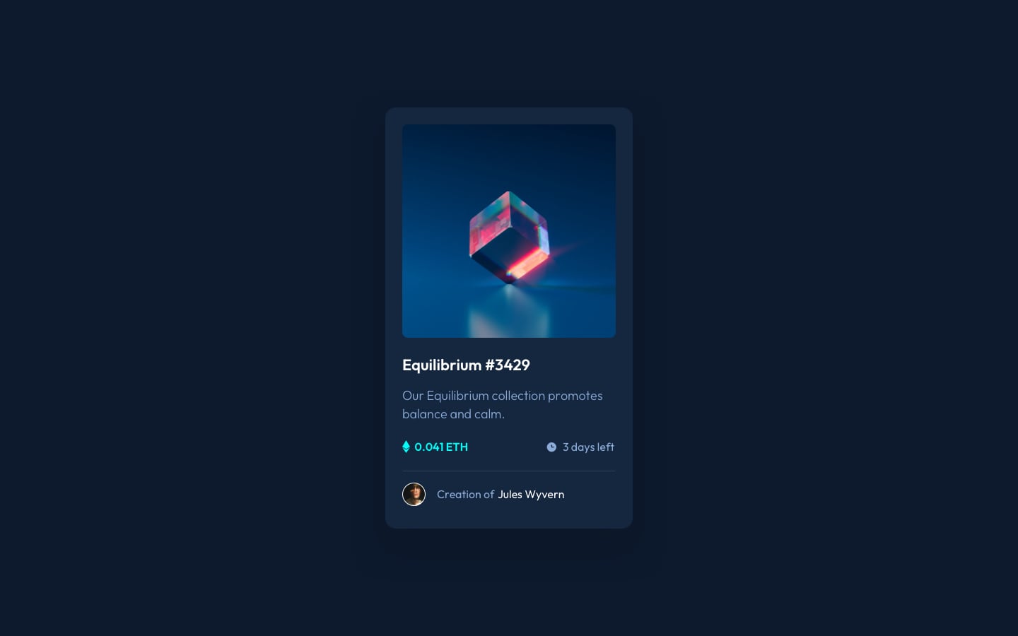
Re-creating an NFT card component with an active status upon hover.
The Process
This challenge was a delightful exploration using HTML & CSS—simple in nature, yet intriguing and enjoyable. The task involved recreating an NFT showcase, complete with NFT art, a unique number, description, price, time left for sale, and the creator's details. Leveraging flex-box for most of the project facilitated the positioning of images and text spacing.
A particularly interesting twist was adding the 'eye' icon over the NFT art upon hover. To achieve this effect, I opted for CSS positioning, utilizing the 'relative' and 'absolute' positions. The key was discerning when to use flex-box and when to use positioning, ensuring the code remained both readable and responsive.
The Design
The design was already provided within the FrontEnd Mentor challenge itself, as the aim of these challenges is to replicate the design as much as possible following the information provided upon starting the challenge as images and a READme file are provided as a guide.

The Challenge
The primary challenge in this project emerged when attempting to center the image hover effect. Initially cautious about using positioning, I later revisited the concept after taking a break. Subsequent research led me to a common and effective approach—setting the parent container as 'position: relative' and the child component (the image to be altered on hover) as 'position: absolute' to the parent. The rest, as they say, is history, or in this case, CSS magic.