NAME OF PROJECT
Four Card Section
LANGUAGES USED
HTML & CSS
DESCRIPTION
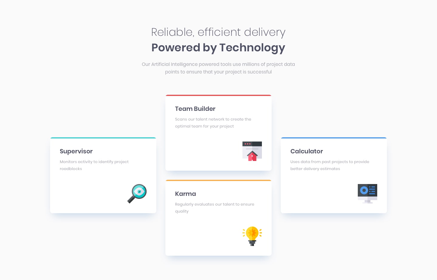
Re-creating a four card responsive section using flex-box.
The Process
This challenge was a delight, especially because it had a simple responsive aspect, something I find enjoyable to work on. As I become more familiar with flex-box, I discovered another way to leverage its capabilities. When I looked at the design, I could already imagine where I would use it, even though the exact 'how' wasn't clear.
Following the principles of responsive design, I started with a mobile-first approach. This approach makes it easier to extend the responsiveness to fit the desired design.
The Design
The design was already provided within the FrontEnd Mentor challenge itself, as the aim of these challenges is to replicate the design as much as possible following the information provided upon starting the challenge as images and a READme file are provided as a guide.

The Challenge
After completing the mobile design, I moved on to refine the desktop version. However, I noticed that the HTML structure for the cards wasn't aligning with the intended design, specifically having the middle section with two cards stacked on top of each other. I quickly grouped the central cards under a class named container, solving the layout issue. This discovery also introduced me to a new way of using flex-box for different layouts.